2024 sales metrics: 15 KPIs to track for better performance
Tracking the right sales metrics leads to better decisions and smarter sales practices. Check out these 15 KPIs to track to boost your team’s performance this year and beyond.
There’s no shortage of data among today’s startups and businesses. In fact, most of us are swimming in it.
Each time we make a sale, receive feedback, drive traffic to our site - you name it - the tools we use are collecting important data. The harder part is organizing that data in a useful way.
That’s where KPI dashboards come in.
KPI dashboards can help guide your entire organization by identifying trends and results based on real-time data that you’re probably already collecting.
Fortunately, creating a KPI dashboard doesn’t have to be expensive or resource intensive in order to be effective. I connected with Lowell Bieber, our Head of Operations at Streak, to learn how businesses can use simple tools to create an effective KPI dashboard for any team.
First, we’ll review what a KPI dashboard is and examples of common ways to use KPI dashboards.
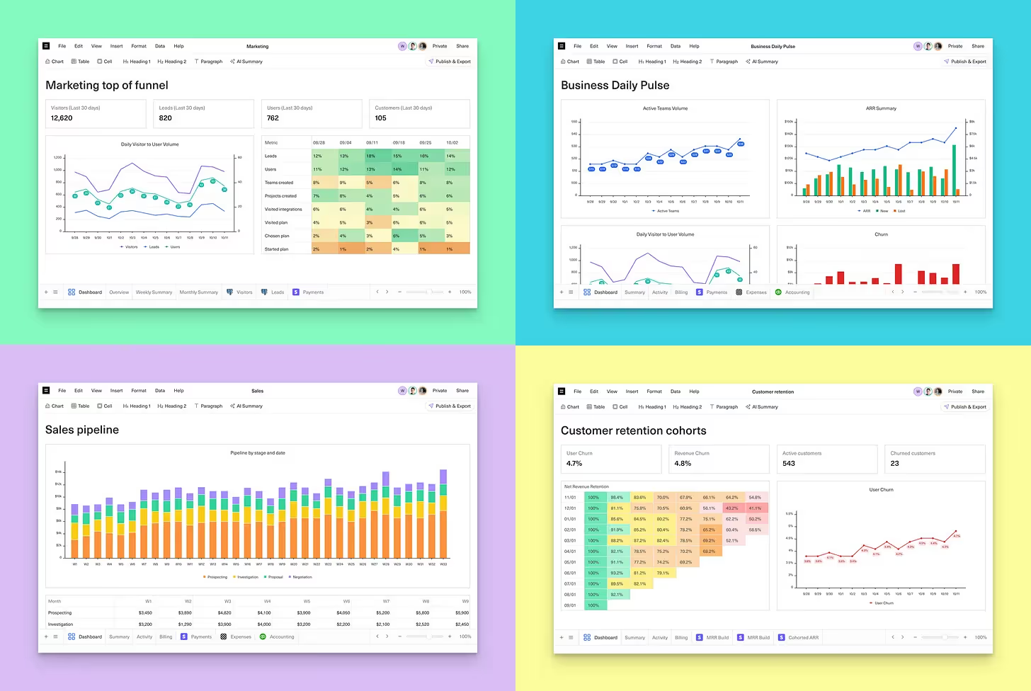
A KPI dashboard is a tool that visually displays key performance indicators (KPIs) from various data sources in charts or graphs for analysis. It helps a company, team, or individual track progress on goals and detect trends in real time.
They give you a snapshot of how your business, team, and individual contributors are performing at any given point so you can make data-driven decisions.
KPI dashboards “keep what matters most to your company top of mind,” as Lowell explains.
More than just providing interesting data, they offer actionable insights that translate to real organizational benefits:
KPI dashboards generally fall into three main categories, each tailored to meet specific needs within an organization.
Executive, operational, and analytical dashboards all provide distinct insights to help teams focus, spot trends, and make strategic decisions that drive progress.
Here’s how each type of dashboard plays a unique role in keeping your organization on track.
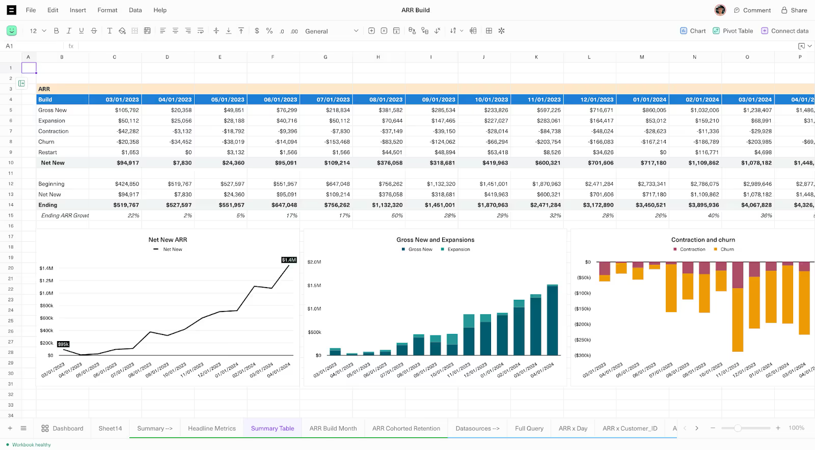
An executive KPI dashboard helps track high-level performance across the company. It allows business leaders to get a quick snapshot of overall business health so they can make informed decisions quickly.
The data points in an executive dashboard often include financials, growth indicators, and metrics around high-priority strategic goals.
For example, at Streak we measure our MRR movement, churn trend, number of active users and teams, and a breakdown of subscriptions for each CRM plan in an executive dashboard. We update and review this data monthly to see how our high-level goals are progressing.
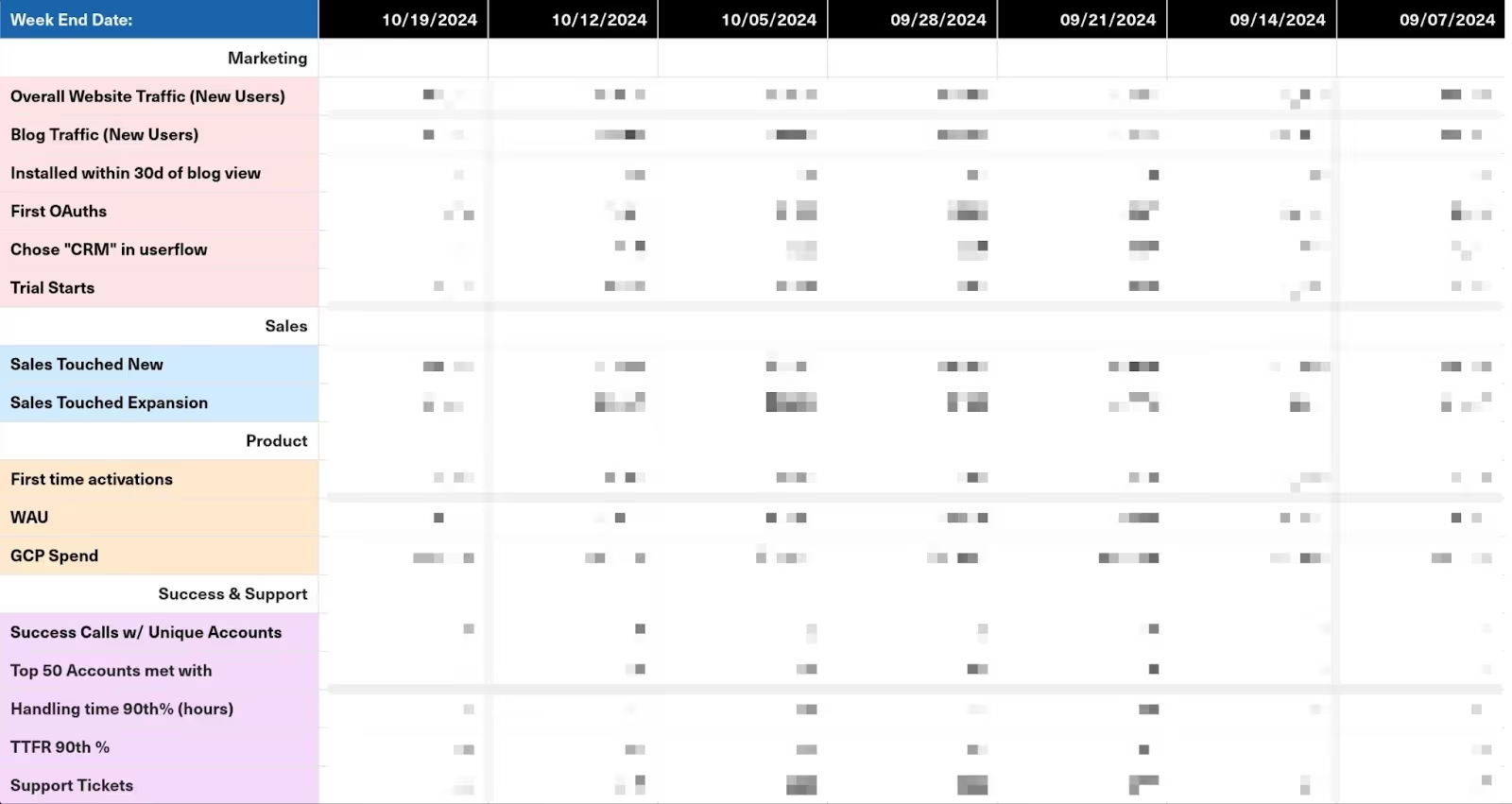
Operational KPI dashboards monitor day-to-day business operations. They help teams manage ongoing processes efficiently and identify issues that need immediate action to keep operations running smoothly.
Operational dashboards typically focus on KPIs around productivity, output, and resource use. They’re not meant to be as strategic as other dashboard types, but instead offer more of a heartbeat for the company.
Teams may review these dashboards on a more frequent basis - weekly or even daily - since they are an early indicator of positive or negative movement on a goal.
Analytical KPI dashboards provide in-depth analysis of complex data sets. They allow analytical roles at an organization home in on key data points that drive larger goals, helping to understand why you’re succeeding or falling short.
Team-specific KPI dashboards focus on metrics relevant to each department or team at an organization. They may include elements of operational or analytical KPI dashboards to give each team a complete view of critical metrics.
Depending on each team’s business objectives, each dashboard will include different KPIs and metrics.
Marketing KPI dashboards help illustrate the marketing funnel to pinpoint areas where campaigns are performing well and where there’s room for improvement.
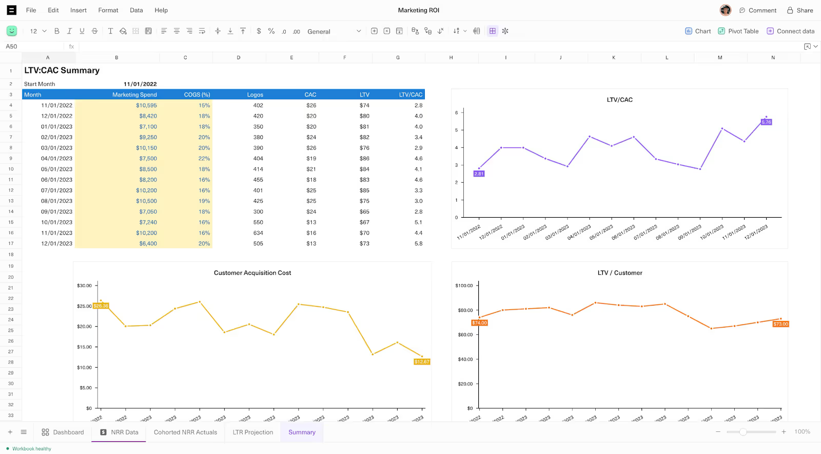
Some KPIs that may be included in a marketing dashboard include:
Sales KPI dashboards help sales managers track their team’s performance, identify opportunities for improvement among specific sales reps or lead types, and focus their efforts to meet revenue goals.
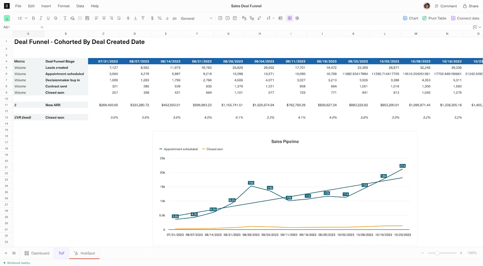
Sales KPI dashboards typically include KPIs that measure:
Support KPI dashboards help customer support teams determine how well they’re resolving customer issues and where they can improve efficiency or customer satisfaction.
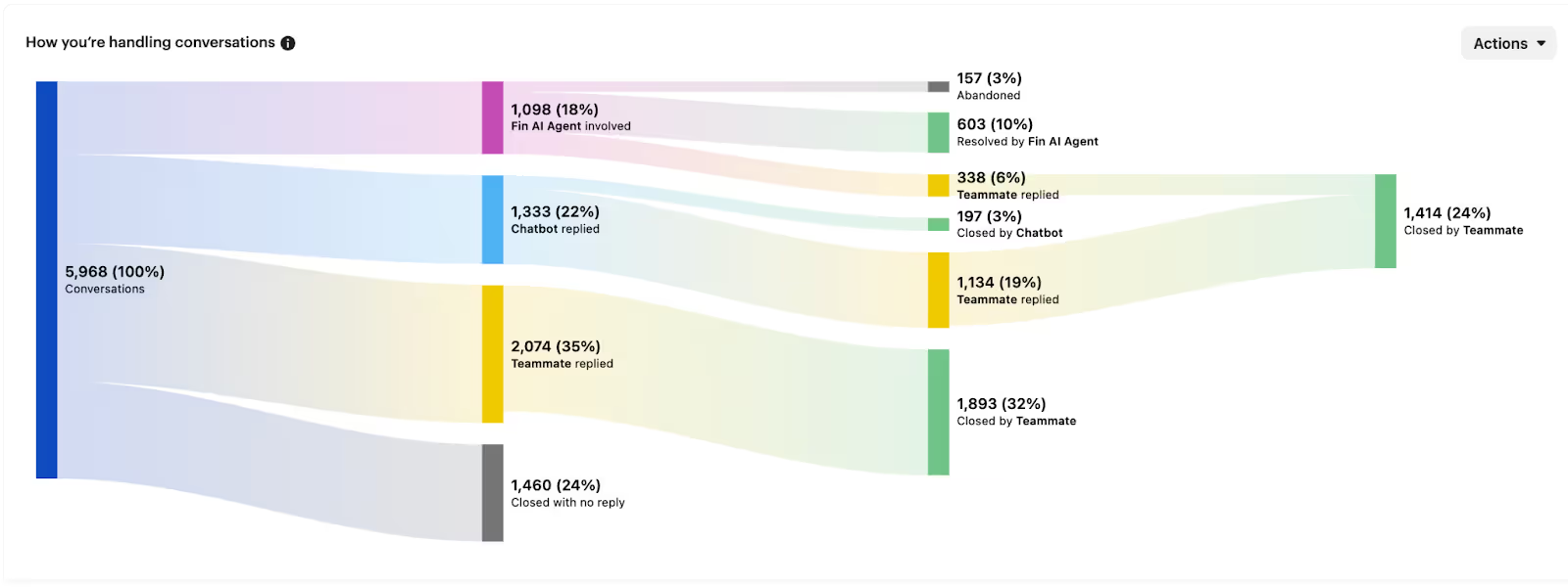

Support team KPI data typically tracks:
Operations dashboards monitor the efficiency and productivity of day-to-day business functions.
Operations KPIs typically include:
An HR KPI dashboard tracks essential workforce metrics to support strategic hiring, improve employee engagement, and boost overall productivity.
HR teams may track:
Planning KPI dashboards for your own team forces you to decide what’s important to measure on a regular basis.
It’s easy to fall into the trap of thinking that more data is better, but according to Lowell, less is more - at least in the beginning. Including too many metrics can be overwhelming and actually make it harder to translate data into decisions.
Start with a few of the most important metrics and remember that “you’ll add additional metrics along the way, so start with what matters most to each team. Remember, the K in KPI is for ‘key’!”
Instead of casting a wide net with your KPI metrics, talk to the leaders of each team to understand what they care about the most.
These 7 questions can help you identify the right metrics to include in your KPI dashboards:
Asking good questions can help clarify the most important metrics to track without overwhelming teams and executives with excess data.
At Streak, we believe the best tool is the one you’ll actually use. That’s why we built a CRM directly into Gmail—and why we chose KPI dashboard software that fits seamlessly into our workflow.
For KPI reporting, the most effective tools are those that integrate directly with your data source and update key metrics automatically. Without this integration, dashboards require manual updates and inevitably fall out of date. Choosing a tool that connects to your data ensures it’s used effectively, rather than collecting dust in your tech stack.
Before shopping around for a new software or tool, figure out where your data is coming from for each KPI. For example, most of our KPI data at Streak comes from BigQuery or Google Analytics for our SQL databases.
We experimented with a few tools that all had a lot of potential. Here are a few KPI dashboard tools we evaluated and can recommend:
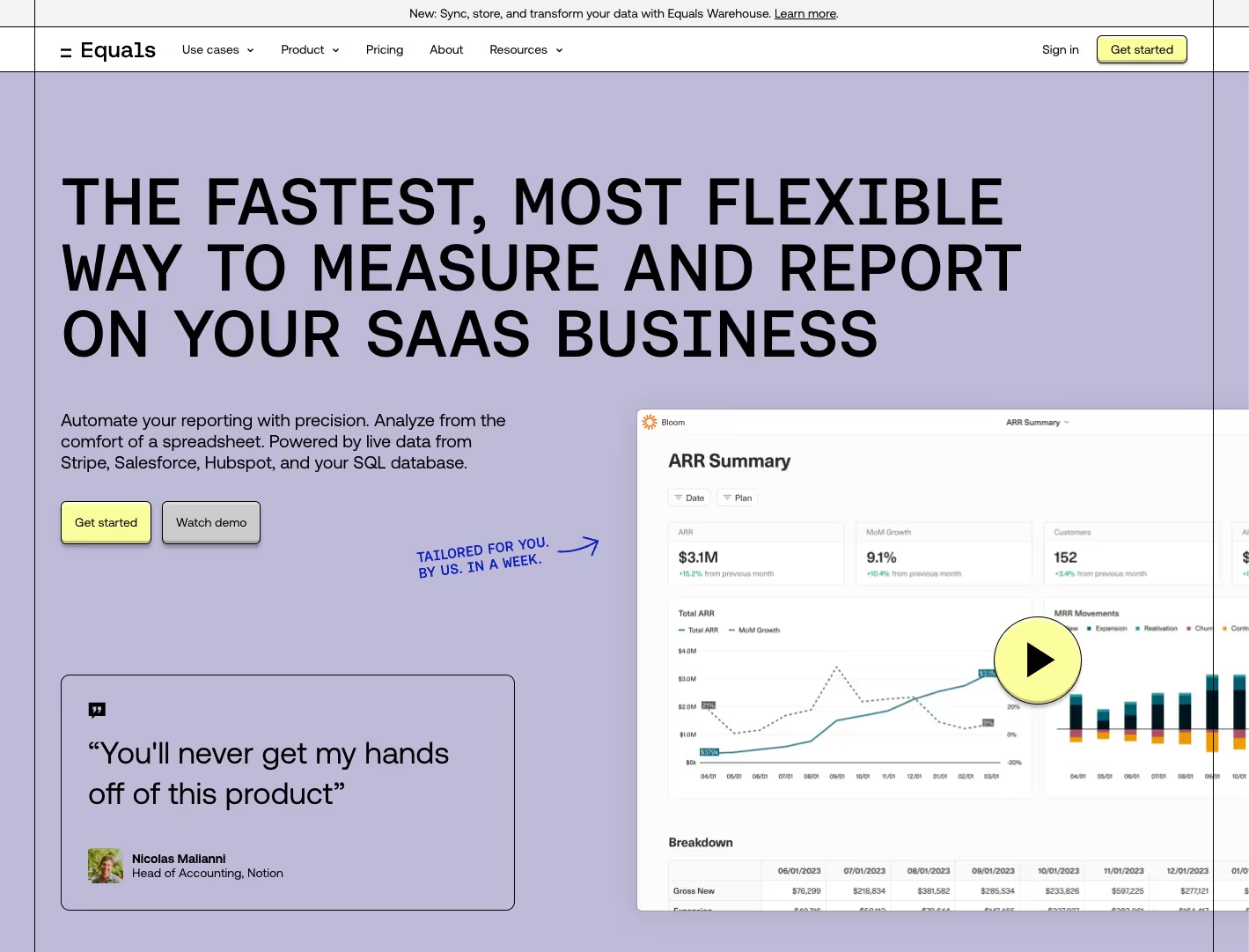
After experimenting with several tools to measure our own KPIs at Streak, we landed on Equals.
Equals markets itself as “the next-generation spreadsheet” and includes live data updates from SQL, which checks our box for direct data source integration.
The main reasons why we chose Equals for our KPI dashboard software are:

Hex.tech stood out as a powerful tool for data-driven storytelling.
This tool allows you to insert text, charts, tables, pivot tables, and more that are updated off of your data queries. Lowell really liked hex.tech for “telling a data-driven narrative to demonstrate one of your conclusions.”
However, he felt it was a better tool for one-off analysis, rather than regular dashboarding to keep our teams updated on key performance indicators.
Retool is a tool for building custom internal apps and software, and is marketed as being “built for developers,” so it has some niche applications but is worth the mention.
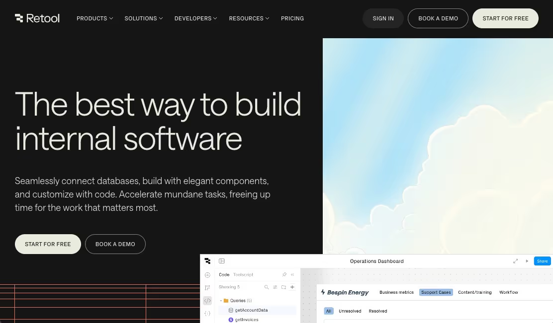
In the past, we experimented with Retool for our Support team metrics and some other dashboards. While we moved to Equals for those, we still use Retool for more product-oriented dashboards.
Retool dashboards are “good at accessing backend information and events for your individual product,” explained Lowell, “so we use them for things like tracking engagement with our Streak AI features and to see how Streak automations are being used.”
While we could easily connect our data sources in Retool, it didn’t have as clean of an interface for dashboarding and we never set up a consistent schedule for our dashboards in Retool.
It should come as no surprise that we use Streak as our CRM to track contacts, deals, and more.
With Streak, you can turn your CRM inputs into actionable insights that support every team’s goals. Streak lets you capture key CRM metrics directly in Gmail. Since it lives inside a tool your team is already using - their inbox - they’re more likely to actually use it and your data is more likely to be complete and reliable.
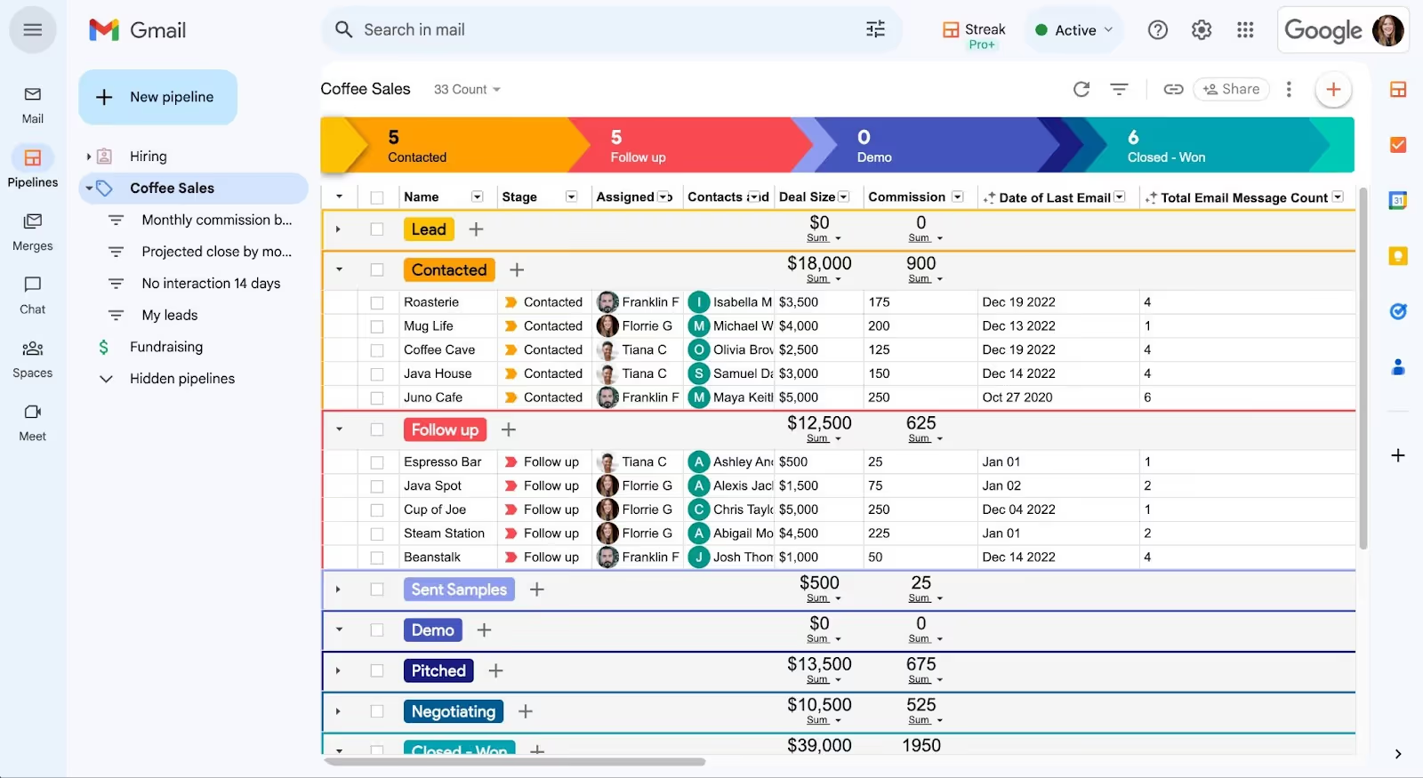
Streak features help you track KPIs in your CRM:
While CRM data is essential, keep in mind that a comprehensive KPI dashboard needs data from multiple teams, like product, marketing, and operations, to give a full picture.
Use Streak’s built-in reporting for quick insights or export to Google Sheets for further customization, but for a true cross-team dashboard, remember to bring in data beyond CRM. Streak integrates easily with reporting tools via API and webhooks so you can combine your CRM data with other key metrics for a complete KPI dashboard.
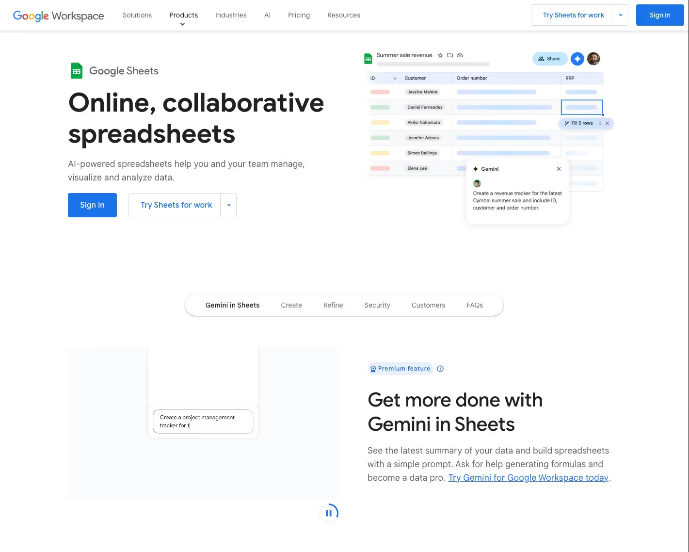
Google Sheets is a great way to track KPI data and share KPI reports across your team for free.
Before swooning over fancy data visualizations and advanced features, remember that the best dashboard is the one that actually gets used.
Regularly updating and sharing KPI dashboards keeps team members aligned, ensuring everyone is informed on progress, can spot trends, and can make timely adjustments to meet goals.
But, just as it’s possible to have too much data in your KPI dashboard, there’s also such a thing as distributing it too frequently.
“If you’re sending out lots of metrics daily,” Lowell explained, “you might be missing the forest for the trees and reacting too quickly to small data fluctuations outside of your control.”
Streak shares one dashboard weekly and one dashboard monthly, although each team or individual may have their own dashboards that they review on a more regular basis.
Daily KPI dashboards should be used sparingly to motivate team members or raise the alarm if something goes wrong.
For example, teams with shorter sales cycles may want to track daily sales to motivate sales reps and inspire healthy competition.
Website and app performance may also be worth daily monitoring to quickly address downtime or performance issues.
Weekly KPI dashboards should help your organization see if a process is “broken” across any part of the business at a glance.
Our weekly dashboard includes more top-of-funnel metrics across the company like:
For example, if our website traffic sharply declines one week, we’ll investigate our traffic sources and website performance to find the cause. Viewing this metric daily would send us on a wild goose chase with natural traffic fluctuations throughout the day and week.
Monthly KPI dashboards demonstrate longer-term trends among high level metrics.
Streak monthly KPI dashboards include:
Reviewing these metrics monthly gives us a clear picture of our growth and retention patterns, allowing us to plan and prioritize initiatives with a long-term focus.
KPI dashboards can help your whole organization, but that doesn’t mean you should turn them over to every person in your company. Deciding who owns and accesses KPI dashboards will help you maintain the dashboards and focus your team.
Designating a clear owner for each KPI dashboard keeps things organized and effective.
The dashboard owner can access all the data, spot trends, and connect with the right team or individual if anything looks off.
Having a dashboard owner also helps your team channel feedback and questions to the right person.
But who should be able to see the data in each of your KPI dashboards?
Lowell explains, “Everyone at your company should be aware of high-level metrics. For us, that’s MRR and churn.”
We have MRR and churn dashboards that any team member can access at any time, and we share regularly in all-hands meetings.
Sharing these core metrics keeps the entire company aligned on top business goals.
When it comes to more granular KPI dashboards, dashboard access may depend on overall team size.
For smaller teams—organizations under 20 people—it’s often useful for everyone to see the entire dashboard. In a smaller organization, each person’s work tends to impact multiple areas, so full visibility helps keep everyone aligned on both high-level goals and specific metrics.
Of course, you’ll need to decide who you want to access this critical data and share accordingly.
Once your team grows beyond 20 people, it makes sense to take a different approach.
Instead of sending detailed dashboards to everyone, Lowell suggests that “the more in-depth dashboard can go out to a smaller group of decision-makers or leaders.” This group can then share relevant insights with their teams, to keep everyone informed without being overwhelmed by too much data.
Here are the most impactful (and sometimes hard-won) best practices we’ve learned along the way to ensure your KPI dashboards are accurate, accessible, and regularly seen by your team.
This may seem like a no-brainer – the data in your KPI dashboards should be accurate, right?
Sometimes this is easier said than done. Ensuring data accuracy can require rigorous testing and analysis, but “the whole company is making decisions off of this, so it matters,” says Lowell.
Bad or inaccurate data can lead your team astray and erode their trust in your analysis.
Just like some of us prefer to learn by video tutorial over reading, people like to consume data in different ways.
Include raw data, typically tables or a spreadsheet, in your KPI dashboard and configure visualizations like charts and graphs to help illustrate concepts and trends.
Don’t rely on your team to check KPI dashboards themselves. Send KPI dashboards via Slack, all-hands meetings, email digests, or other methods used at your company at a regular frequency.
While your data integrity and accuracy is important to get right from the beginning, it’s helpful to accept that your KPI dashboard might (should?) always be a work in progress.
Once you start generating and sharing KPI dashboards, you’ll get feedback and find out what people really care about along the way. If you’re not getting feedback, ask for it.
