That's how many active Google Sheets users there are around the globe.
When Google Sheets was first released, it was mainly used to create and manage data spreadsheets. However, over the years, Google Sheets has evolved and become a full-fledged data management and visualization tool that people use both personally and professionally.
Speaking of visualization, one of Google Sheets' most powerful features is its ability to create charts and graphs. These visual representations of data make it easier for users to understand complex information, identify patterns, and draw conclusions. So, instead of presenting a wall of numbers or text, you can use charts and graphs to make your data speak for itself. After all, humans are visual creatures and are more likely to retain information presented in a visual format.
Whether you're dealing with large datasets or trying to communicate complex concepts, here's how to make a chart in Google Sheets using four simple steps so you can present your data in a visually appealing and easily understandable format.
<a href="#making-chart-google-sheets" class="anchor-link">Making a chart in Google Sheets</a> <a href="#chart-vs-graph" class="anchor-link">Chart vs. graph</a> <a href="#chart-style-options" class="anchor-link">Chart style options</a> <a href="#downsides-google-sheets" class="anchor-link">Downsides of Google Sheets</a> <a href="#benefits-streak-reports" class="anchor-link">Benefits of Streak reports</a>
Basic steps: Making a chart or graph in Google Sheets
The steps to create a chart in Google Sheets are as follows:
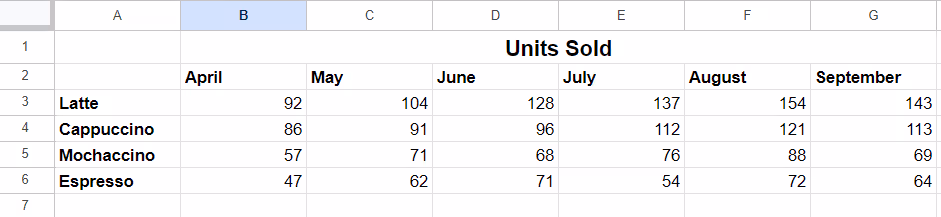
Step 1: Organize your chart data
The first step in creating a chart is to organize your data in a Google Sheet. This can be done in three ways:
You can input data manually into blank cells.
You can copy and paste it from another data source.
You can import it from a file, like a .csv, .html, or .xls.
It's important to have your data in a structured format, with columns and rows clearly labeled, for the chart to be accurate and meaningful. It's also worth noting that you need at least two columns or rows of data to create a chart.
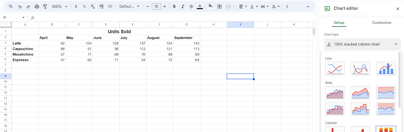
Once your data is organized, the next step is to select the specific range of cells that you want to include in your chart. This can be done by clicking and dragging over the desired cells or by using keyboard shortcuts such as Ctrl+A (Windows) or Command+A (Mac) to select all cells. Once your data is selected, click on the "Insert" tab and choose the "Chart" option.
After clicking the "Chart" option, a chart editor will appear on the right side of your screen. This is where you can choose the type of chart or graph you want to create, such as a bar graph, column graph, pie chart, line graph, and more. This is where you can also make changes to the data range, data labels, and other chart elements.
Step 4: Customize your chart
Finally, in the chart editor, you'll find a tab called "Customize," where you can make additional changes or personalize your chart. This includes changing the chart's background and border colors, data spacing metrics, font style, axis titles, legend placement, and more.
You can also switch between columns and rows if needed or remove or add a series to your chart. The options are endless, and the customization allows you to create a chart that fits your specific needs.
Chart vs. graph: what’s the difference?
The terms "chart" and "graph" are often used interchangeably, but there's a subtle difference between them.
Charts present complex data in a simple, visual format that conveys a relationship between variables.
Graphs, on the other hand, are mathematical diagrams that represent data as points or lines, showcasing patterns and trends.
To put it simply, charts focus more on presenting information quickly and clearly, while graphs delve deeper into the relationship between data points.
What are the different chart style options within Google Sheets?
So you know how to make a chart in Google Sheets. Now, take a look at the different types of chart and graph styles you can choose from to customize your chart’s style and appearance. Below are some of the most common chart types:
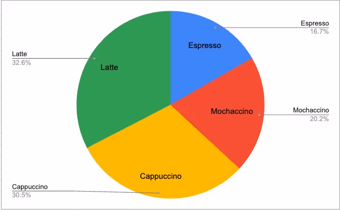
Pie chart
A pie chart is a circular graph that displays data as "slices" of a whole. Each slice represents a different category, and the size of the slice indicates its proportion to the total.
Best use cases for pie charts:
Region-wide sales of a particular product
Revenue distribution among different products
Percentage of customers from different regions
Bar graph
A bar graph, also known as a bar chart, uses horizontal or vertical bars to display numerical data. The length of each bar represents the associated value, and the color can differentiate between different categories or series.
Best use cases for bar graphs:
Comparison of sales performance across multiple regions
Comparison of website traffic from different sources
Distribution of employees by job titles or departments
Column chart
A column chart is similar to a bar graph, but the bars are displayed vertically. This chart type can be useful for displaying data over time or comparing categories within a single series.
Best use cases for column charts:
Changes in revenue over a specific time period
Comparison of monthly expenses for different categories
Breakdown of customer demographics by age or gender
Combo chart
As implied by its name, a combo Google Sheets chart combines different chart styles into one, mainly using a bar or column chart with a line graph overlay. This style is useful for displaying multiple types of data on the same chart.
Best use cases for combo charts:
Displaying both sales and profit trends over time
Comparing website traffic from different sources while also tracking conversion rates
Visualizing customer satisfaction ratings along with average response times
Area chart
An area chart is similar to a line graph, but the area under the line is filled with color. This style can be useful for showing a trend over time or comparing multiple series.
Best use cases for area charts:
Comparing total revenue and expenses between different products of a company
Visualizing website traffic over time and identifying peak periods
Tracking inventory levels and predicting future stock needs
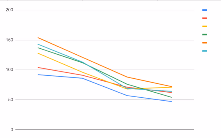
Line chart
A line chart is a basic graph that displays data points connected by lines. Typically, this style is used to show trends over time.
Best use cases for line charts:
Comparing monthly sales data to identify trends
Displaying stock prices and predicting future values
Trend analysis of customer satisfaction ratings over time
Candlestick chart
A candlestick chart is commonly used in financial analysis to display stock prices over time. The chart is made up of "candles" that show the open, close, high, and low prices for a particular time period.
Best use cases for candlestick charts:
Analyzing stock market trends and patterns
Comparing daily currency exchange rates
Tracking cryptocurrency prices and fluctuations
Scatter chart
A scatter chart, also known as a scatter plot, is used to visualize the relationship between two variables. Each data point is represented by a dot on the chart, with its position determined by its values for the two variables.
Best use cases for scatter charts:
Analyzing correlations between customer satisfaction ratings and sales figures
Visualizing the relationship between advertising budget and website traffic
Comparing revenue vs. expenses over time
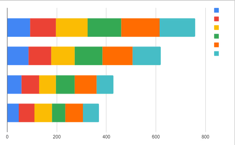
Stacked bar graph
A stacked bar graph is a type of bar chart that displays the total value of a category as well as its subcategories. Each bar in the graph is divided into segments, with each segment representing a subcategory and its contribution to the total.
Best use cases for stacked bar graphs:
Comparing sales figures by product category over time
Displaying market share for different brands/companies
Visualizing survey results with multiple response options
Real quick: what are the downsides of using Google Sheets?
Now that you know how to make a chart in Google Sheets, let’s spend just a moment on Google Sheets’ limitations. Watch out for these drawbacks:
Not mobile-friendly: Google Sheets may not display charts and graphs properly on smaller screens, making it difficult to view or analyze the data on the go.
Potential slowness with large datasets: Google Sheets can slow down when dealing with a large amount of data, which can affect the accuracy and timeliness of your visualizations.
Limited customization options: Compared to other chart and graph creation software, Google Sheets has a limited number of design and customization options, many of which are "basic" or "generic".
Limited data import options: Google Sheets doesn’t play nicely with all file types when it comes to importing data from external sources. It only provides a few options; otherwise, manual data entry is required.
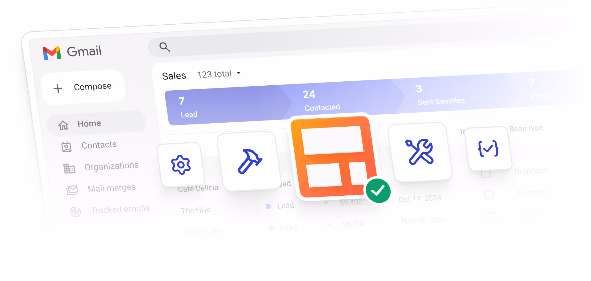
Benefits of using Streak reports as a Google Sheets alternative
At Streak, we offer a 360-degree productivity tool, CRM, and customizable pipelines that directly integrate with Gmail so you don't have to juggle multiple tools. And because we know the limitations of Google Sheets, we designed Streak reports to overcome them.
Some of the benefits you can expect from using Streak reports include:
Endless customization options: No two businesses are the same, so why should their charts and graphs be? With Streak reports, you can customize your visualizations to fit your brand and specific needs.
Real-time data integration: Streak reports are integrated directly with Gmail, automatically pulling real-time data from your pipelines for seamless data management and measurement.
Advanced custom reports with saved views: With Streak's saved views, you can create custom reports that are automatically updated with the latest data from your pipeline. No more manual updates or creating new charts and graphs every time.
One-click link creation: Sharing your Reports with team members or clients is as easy as pressing a button. Simply generate a shareable link, and send it to whoever needs access to your data.
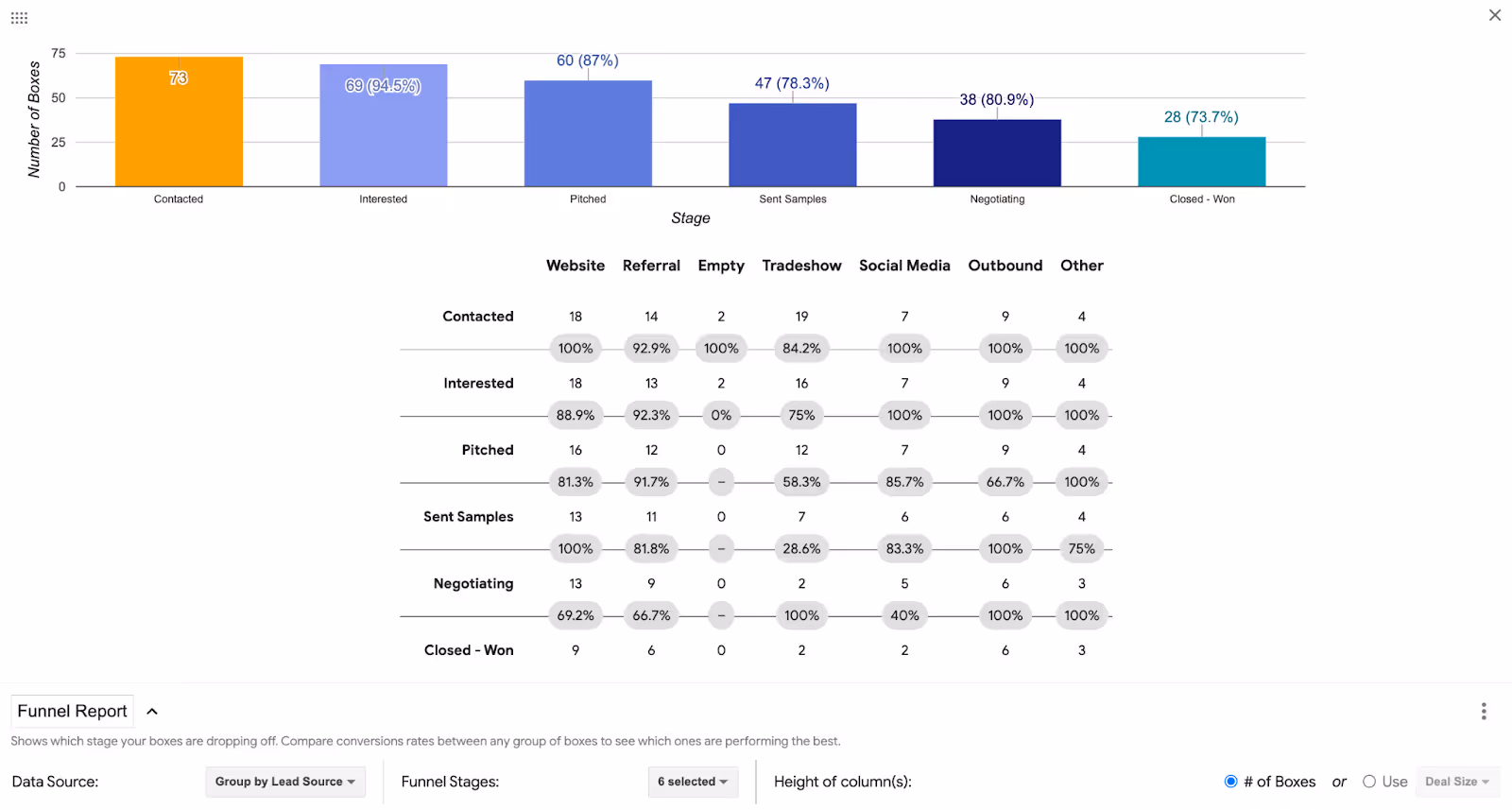
Funnel reports to increase conversion: With Streak's funnel reports, you can easily track the progress of leads in your sales pipeline and identify areas for improvement. Hone in on variables in your funnel like lead source, sales rep, and more to see conversion rates at a granular level. Optimizing your sales process with funnel reports you can increase conversion throughout your deal cycles and drive more revenue.
Don't limit yourself to the basic features of Google Sheets. Upgrade your productivity and sales game with Streak reports. Add Streak to your Gmail today and see the difference for yourself. Happy reporting!